The details,
all in one place.
The Logo
Our logo brings a distinctive symbol and a confident wordmark together. Use the original artwork, preserve its proportions and give it room to breathe.
Download Logo AssetsSVG and PNG · light, dark and transparent1.5 MB
Clear space
Let x equal the diameter of the green dot. Keep at least 1x clear around every side of the logo, free from text, other marks and container edges.
Minimum size
Start at 160 px wide for digital use or 40 mm for print. At smaller sizes, use the primary symbol. Always check legibility at the final size.
Backgrounds that let the logo lead
Full colour on white
Our primary treatment. Keep all three symbol colours exact.
Full colour on navy
Use white lettering. Keep the green dot distinct from its background.
Keep full-colour artwork off green backgrounds. Never stretch, recolour, rotate or retype the logo.
The Symbol
Three simple shapes. One recognisable identity. Our primary icon is the shorthand for Flex across app icons, social profiles and compact spaces.
Three parts.
One identity.
App icon and social avatar
Centre the full-colour primary symbol on white. Use the icon itself for the profile picture, with a generous margin for circular cropping.
Flex Colour
Orange leads with energy. Green adds depth. Yellow brings a spark. Use the exact palette, supported by calm white and navy surfaces.
Download colour tokensFlex Orange
HEX #FD550A
RGB 253 · 85 · 10
Flex Green
HEX #015D47
RGB 1 · 93 · 71
Flex Yellow
HEX #FFBA08
RGB 255 · 186 · 8
The supporting palette
Colour with clarity
Use navy text on orange and yellow. White text works well on green. For ordinary text on white, use navy or green rather than orange.
Keep the artwork exact
Logo fills stay the same in every theme. Convert colours for the chosen print process and approve a physical proof before production.
Typography
A clear hierarchy gives every message its place. A primary face brings character to headings; a secondary face keeps the working interface readable.
Font pairing under reviewHeadlines with character.
600–800 for page titles, section headings and short brand statements.
Clarity in every detail.
400–600 for paragraphs, navigation, forms, buttons and tables.
Motion
Use the brand reveal to introduce Flex with a confident rise, snap, and bounce.
Download Motion AssetsLottie, animated SVG, video and static fallbacks5.7 MB
 Rise, snap, bounce / 3 seconds
Use the settled symbol when continuous animation is unnecessary.
Stationery
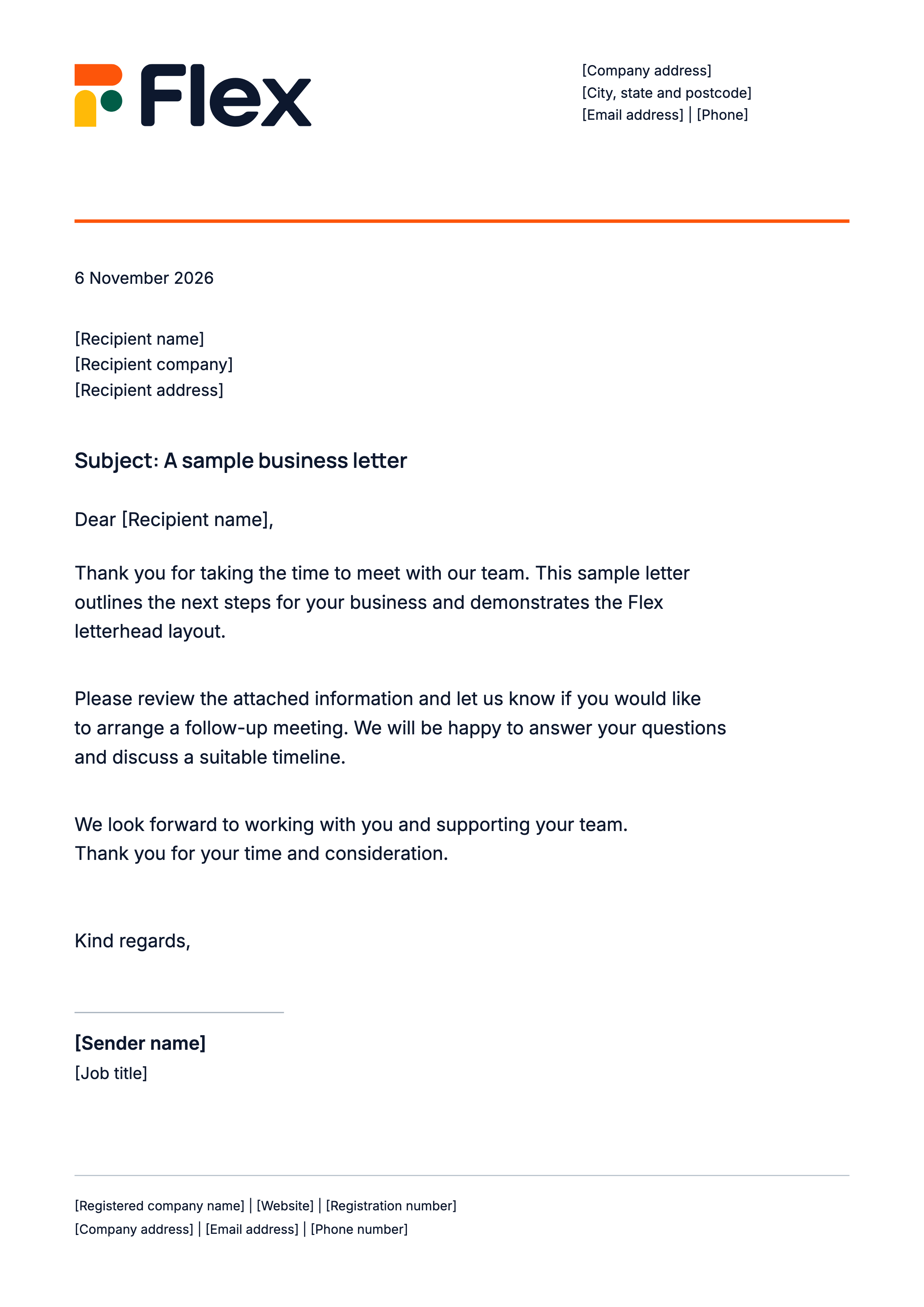
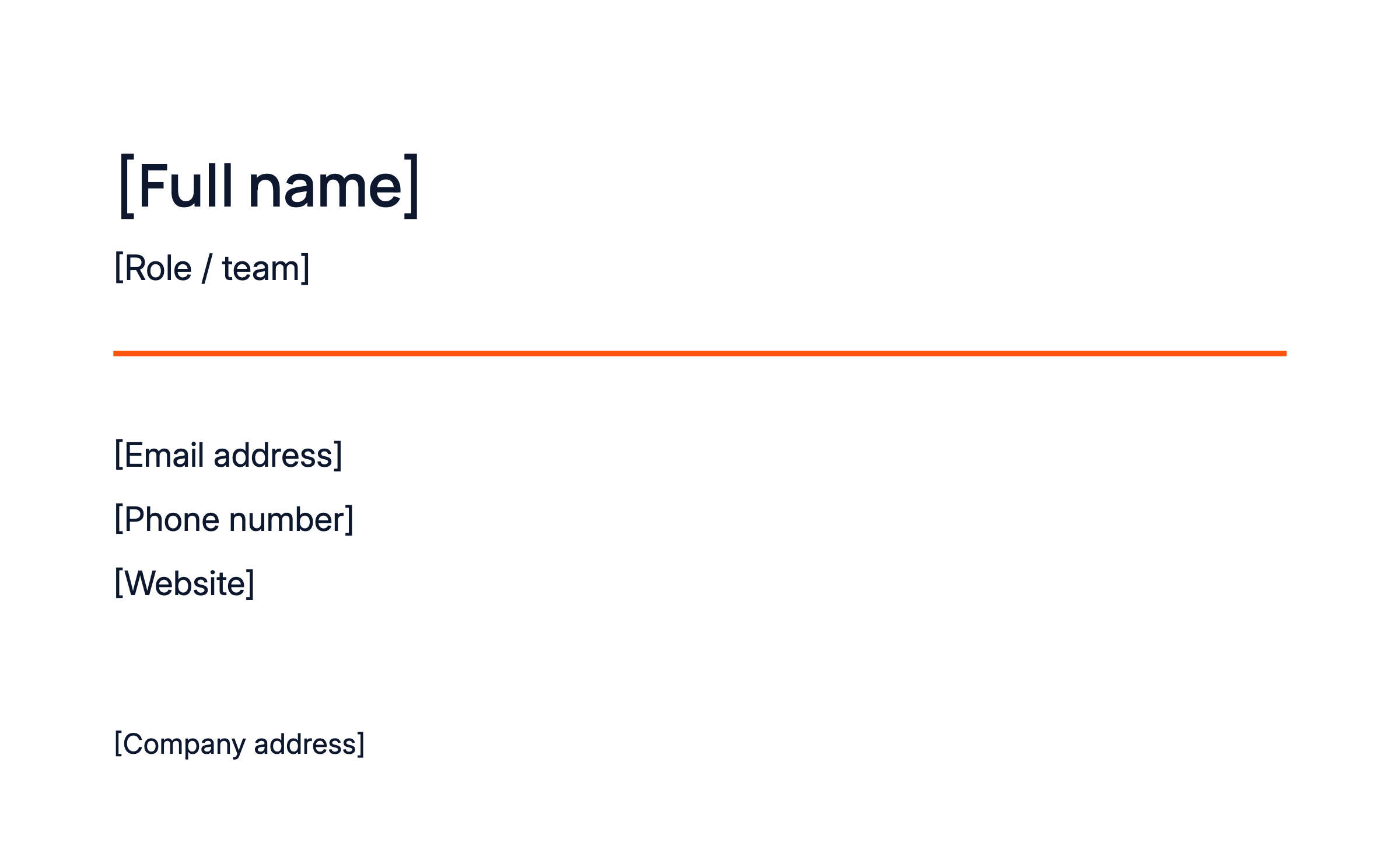
Thoughtful from the first line. Our correspondence uses a clean header, aligned details, subtle rules and a clear, readable letter format.
Download StationeryA4 letterhead, business cards and DL envelopes5.9 MB
Product Family
Five connected products. One Flex identity. Each lockup pairs the parent artwork with a product descriptor, using the same palette and spacing principles.
Resources
The source of truth, ready to use. Download the guide or take the individual asset packs into your next project.
Brand guidelines
The complete 22-page guide
PDFComplete editable kit
Guidelines, social templates and stationery
SVG, PNG, HTML & PDFLogo assets
Parent identity, symbol and all five sub-brands
SVG & PNGMotion assets
Brand reveal, loading loop and static fallbacks
Lottie, SVG, video & imagesSocial templates
Posts, stories, covers and primary icon avatar
SVG & PNGStationery
Letterhead, business cards and envelopes
SVG, PNG & PDFProduct UI guidelines
Spacing, corners, components and theme standards
MarkdownPreview typefaces
Manrope and Inter, with their licences. Pairing under review.
TTF & licence files
Social Media
06One recognisable identity, wherever we show up. Pair bold crops of our symbol with clear headlines and generous space. The primary icon is always the profile picture.
Download Social TemplatesEditable SVG and PNG · dummy copy ready to replace16.1 MB